Innovative virtual classroom tool for teaching anything, to anyone, from anywhere

This case study details the UX research and design process for two key ChalkCast features important for engagement while teaching virtually. In previous research we had discovered that one of the biggest challenges when teaching remotely is engaging the students and encouraging interaction. For example, in most classes students refuse to turn their camera on and may not even be there at all. How can learning remotely be more fun and engaging?

MY ROLE
  • UX Research
  • UX Design
  • UI Design
  • Product Design
  • Prototyping (Figma + HTML/CSS/JS)
  • Innovation
COLLABORATORS
  • Brennan Banta
  • Christina James
ACCOMPLISHMENTS
  • Led UX / UI design for this educational technology startup (virtual classroom tool).
  • Rebranded company and collaborated with mid-level UX designer to produce a more consistent and cohesive brand and design system.
  • Designed and built company's front-facing brochure site (https://www.chalkcast.org) (HTML/CSS/JS)
  • Conducted semi-structured interviews and usability tests with more than 30 teachers and students which led to key insights and better prioritization of features.
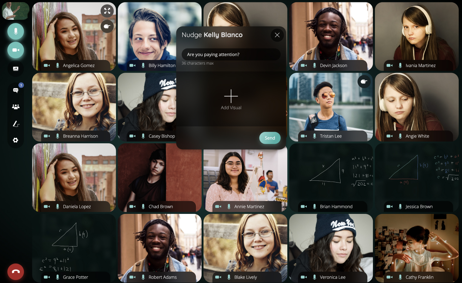
  • Designed and prototyped numerous features for remote learning including a quiz tool, chalkboard, multi-screen share, nudges, breakout groups, automated attendance, session history, etc.
  • Design work led to a 300% increase in customer sign-ups and product trials.

PROBLEM

How do we help teachers engage their students more in remote classes?

RESEARCH

In order to discover needs as well as the challenges associated with engagement, we conducted semi-structured interviews with 8 teachers and 7 students. Additionally we conducted informal usability studies with these participants to test various low-fidelity prototypes of the quiz and chalkboard features. Think aloud protocol was used so that we could better understand the mental model of these participants regarding how they would use these tools.

This yielded over 600 codes (stickies) which we then synthesized into categories and themes that we could share with the team. In order to mitigate bias we ensured categories reflected the views of multiple participants (multiple colors).

PERSONAS

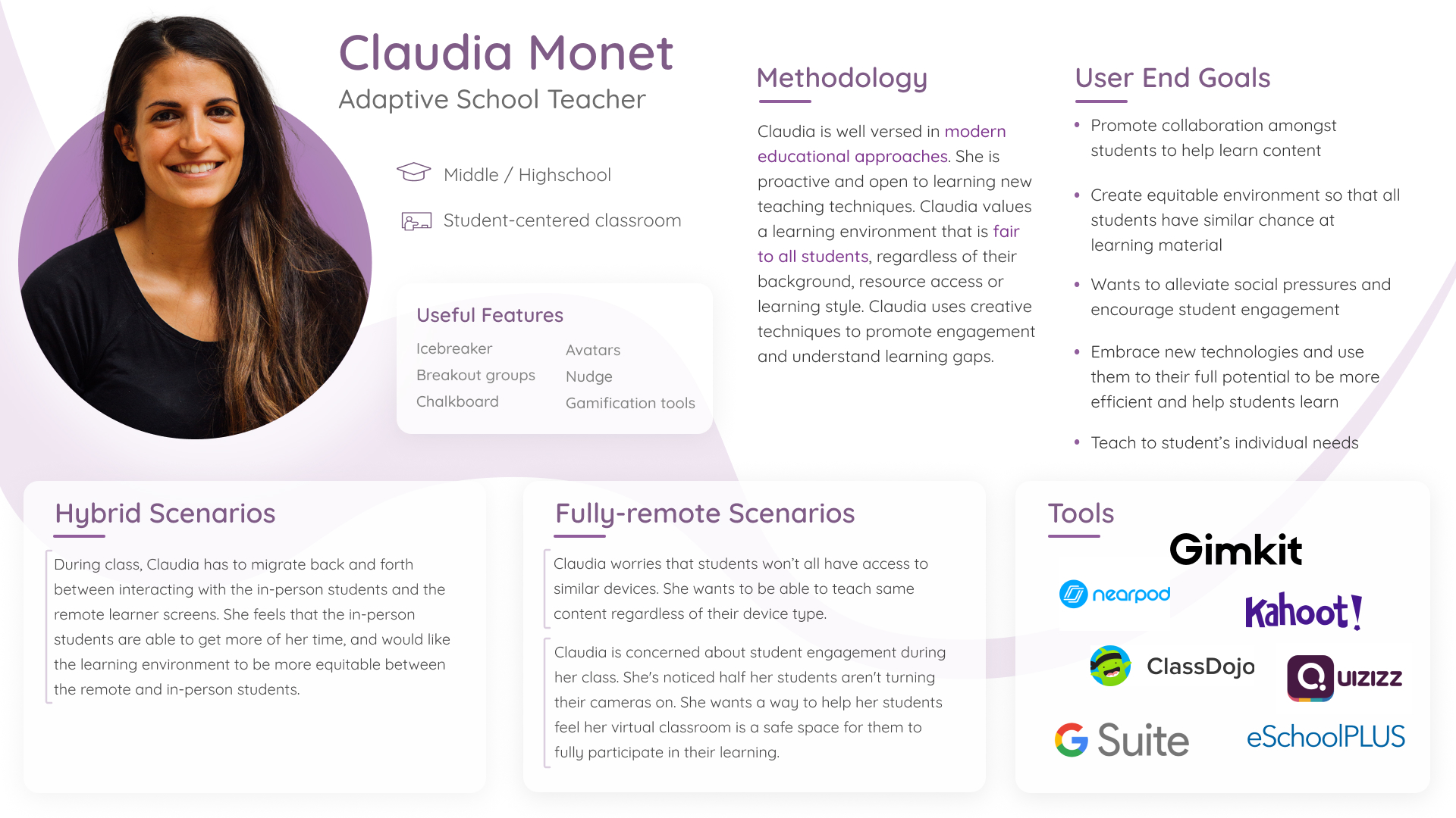
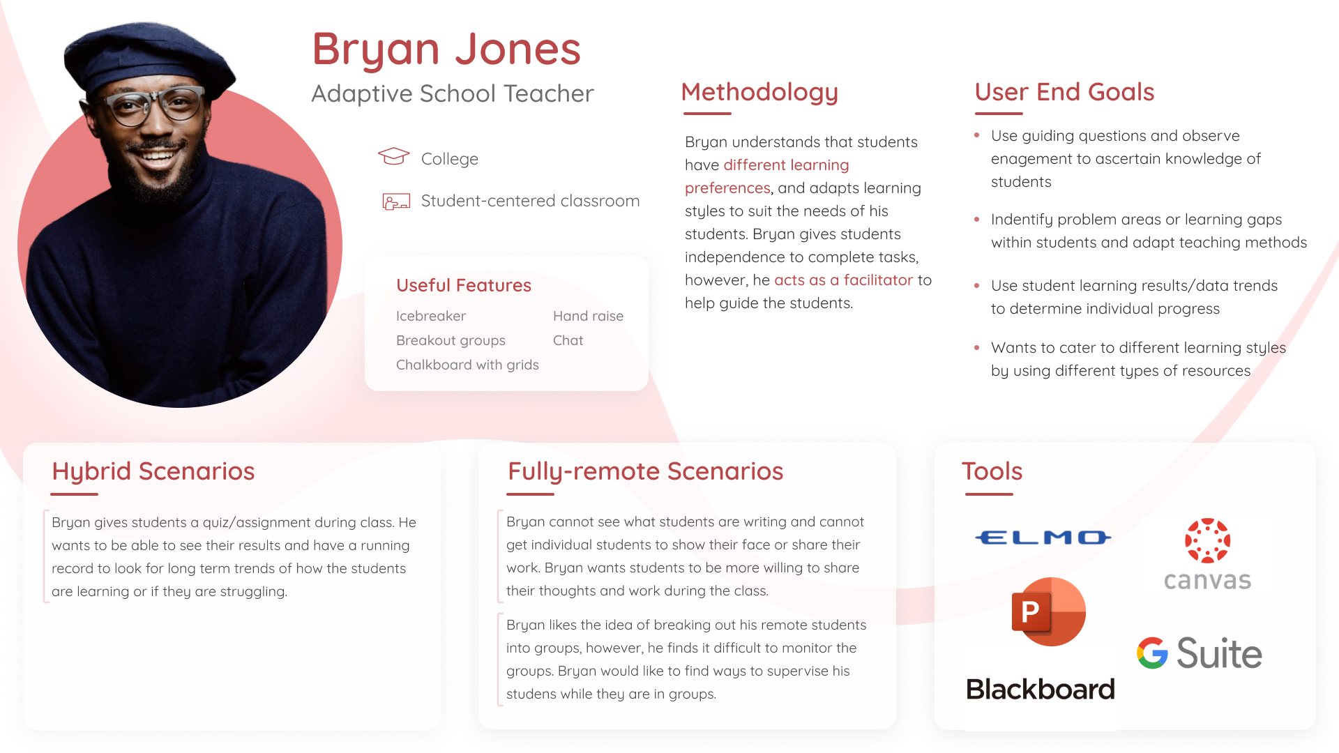
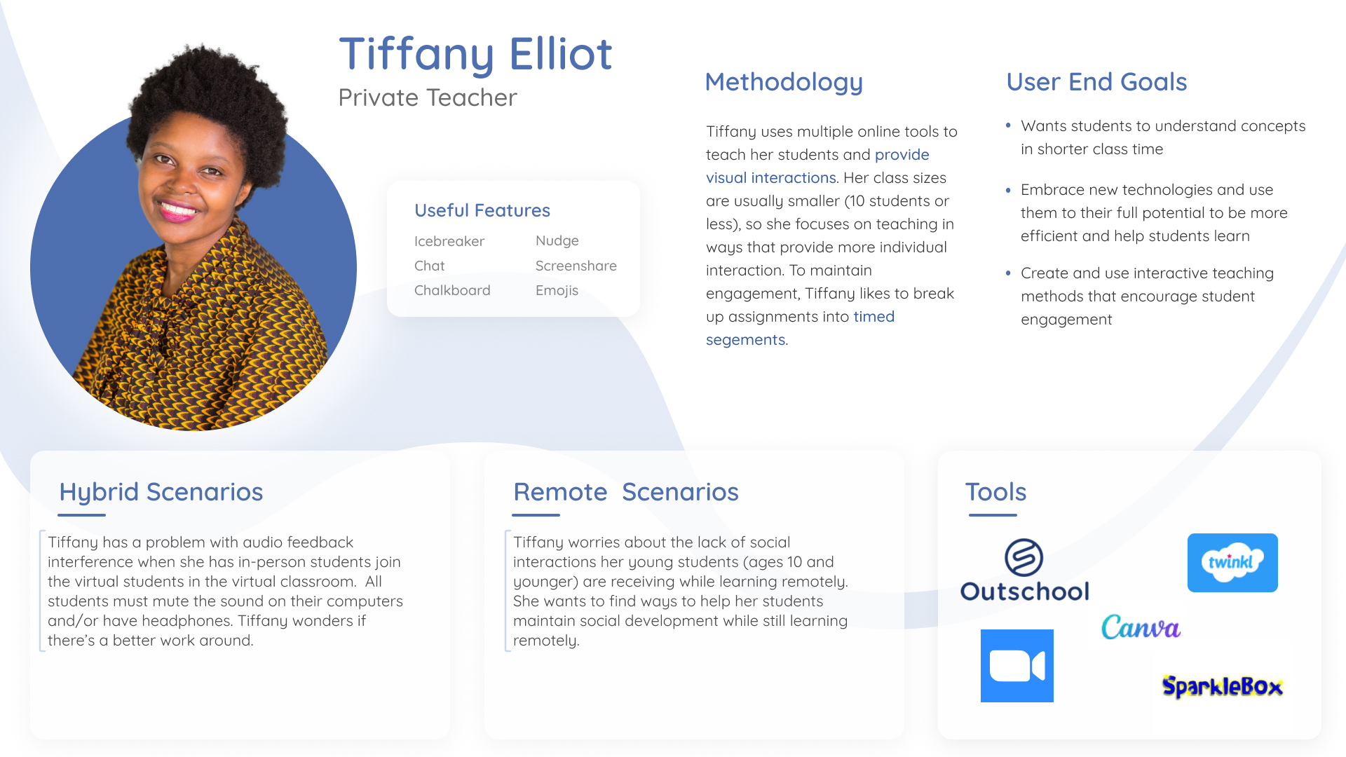
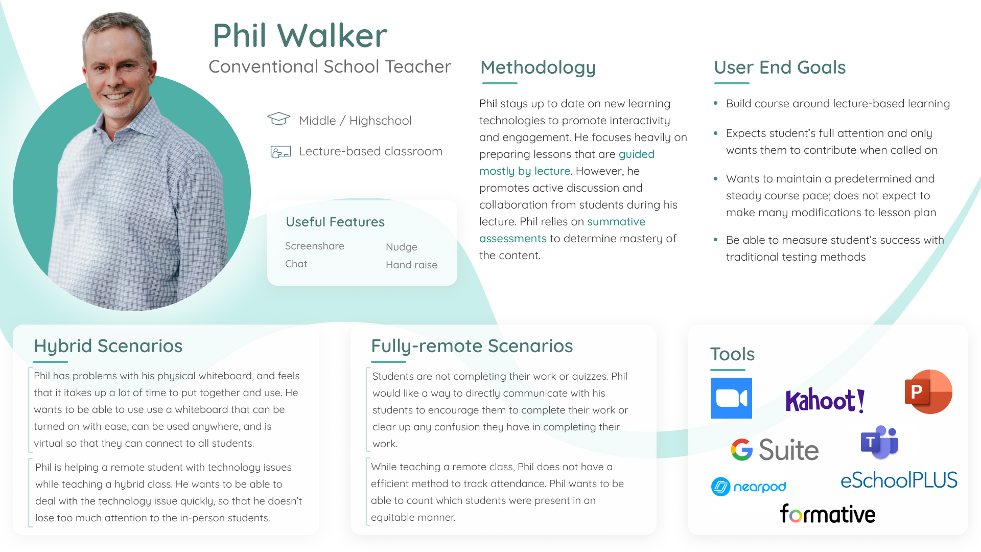
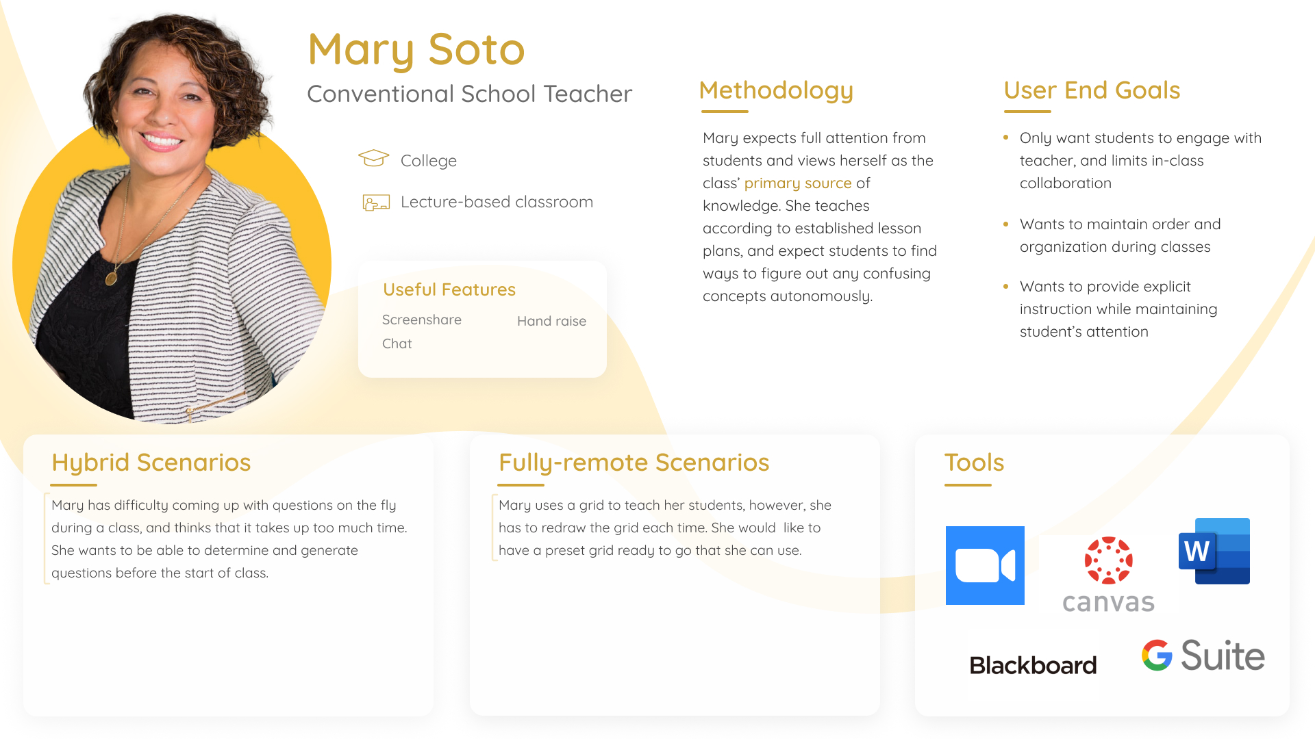
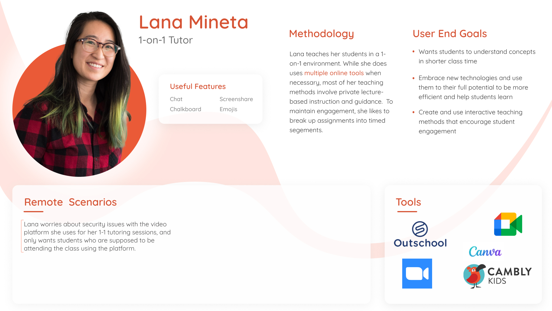
Our primary personas were tech-savvy adaptive teachers who were open to using the full suite of features to make learning experience as fun and engaging as possible for their students.

THEMES

It's important to synthesize research data in to a form that is easily digestible by product managers, engineers, and other stakeholders on your team. These slides are examples of the themes discovered from the research. Most importantly, these facilitate a conversation around complexity and prioritization of features, as well as a plan for versioning (V1, V2, V3, etc.) feature development over time.

VALUE VS EFFORT PLANNING

The research was also extremely valuable for the product team to prioritize features based on what will be most valuable to the end users, and then to determine with engineering which of those will require the least effort. The top left quadrant is the "low-hanging fruit" - Features that are both valuable and relatively easy to develop.

WIREFRAMES AND USABILITY TESTING

Wireframes and prototypes were explored in Figma. Variations of the designs were tested with the previously mentioned 8 teachers and 7 students. Think aloud protocol was used so that we could better understand the mental model of these participants regarding how they would use these tools. This led to great insights with regards to initial feature set and interaction details.

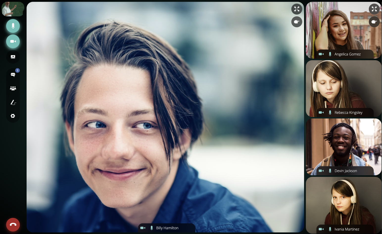
We built the ChalkCast product while using the product for team meetings! It was a fantastic way to find bugs and improve the quality of the product.

BRAND AND DESIGN SYSTEM

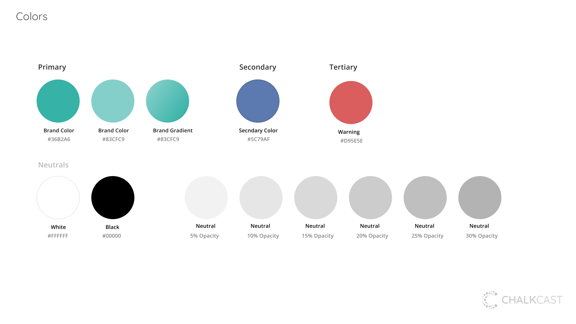
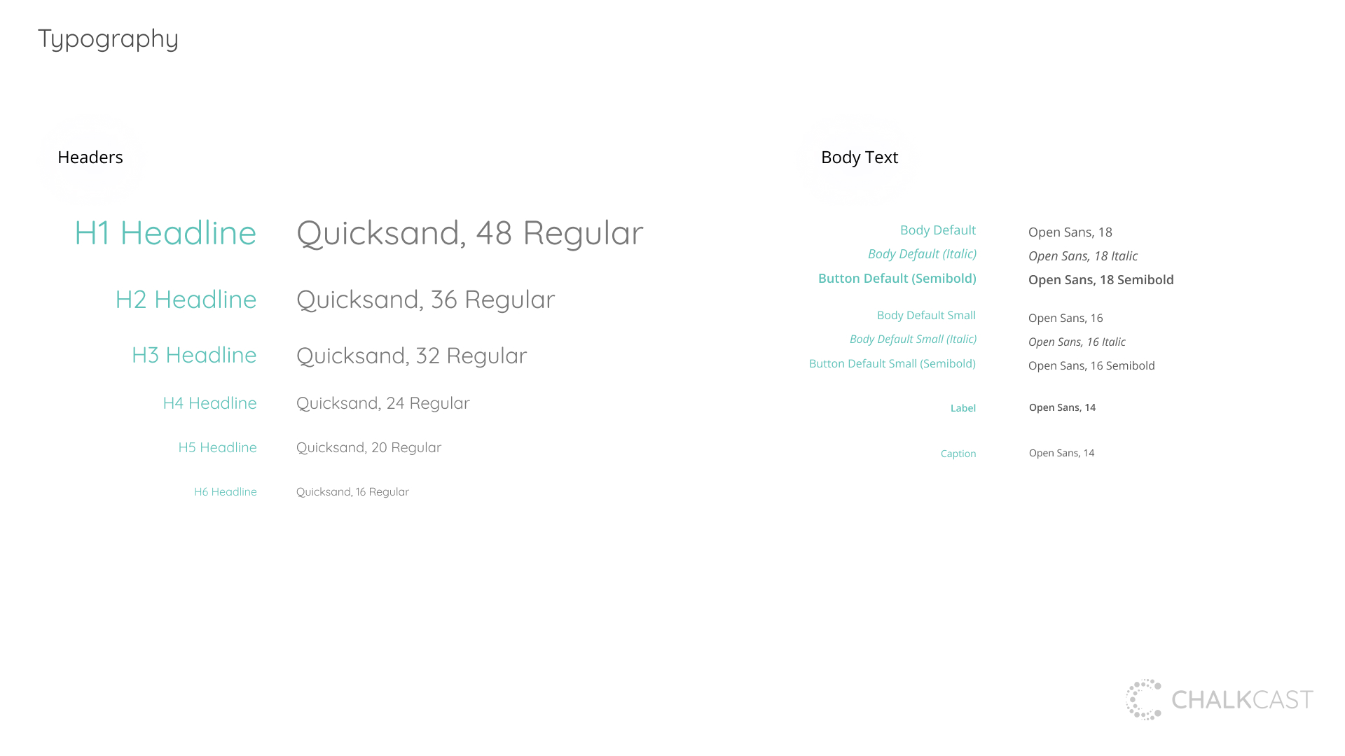
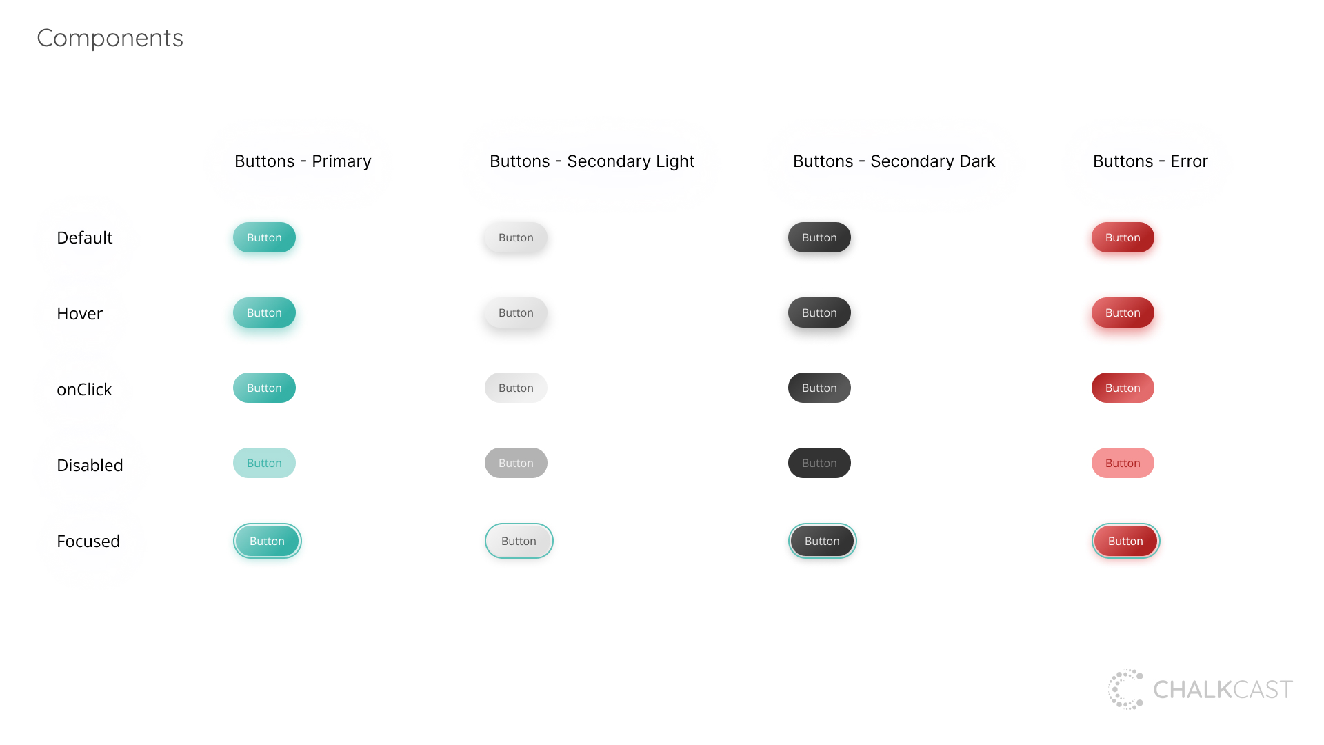
When I joined ChalkCast I led a rebrand. I went for a more simple monochromatic design, playful yet elegant typography, and a flexible light / dark UI system. Rounded corners emphasize a fun and friendly product for educators and their students.

FINAL DESIGNS

PROTOTYPES

Icebreaker (Quiz)

View Prototype

Chalkboard

View Prototype

"Not only is Blake a creative thinker and talented designer, but he delivers, and gets things done. We've done some of our best product work building on the foundation of Blake's ideas. His passion and enthusiasm are infectious, and everything is more dynamic when he's around. He is a terrific networker as well, with a tremendously positive outlook on life. I loved having Blake on my team."

Kate Migliazzo

Senior Product Manager

"Blake brings an advanced set of programming skills to his design tool belt that make executing features a breeze. During my time working with him, he created high-fidelity mockups that felt so accurate to the real product, our design and research team was better positioned to get meaningful feedback from user testers. Blake also came into our company ready to analyze and improve our information architecture which helped realize the scope of our product. I recommend Blake to teams of any size looking to improve their product and design processes, especially those in the ed tech field, which Blake has demonstrated an immense passion for."

Brennan Banta

Product Designer