Health Checkup App

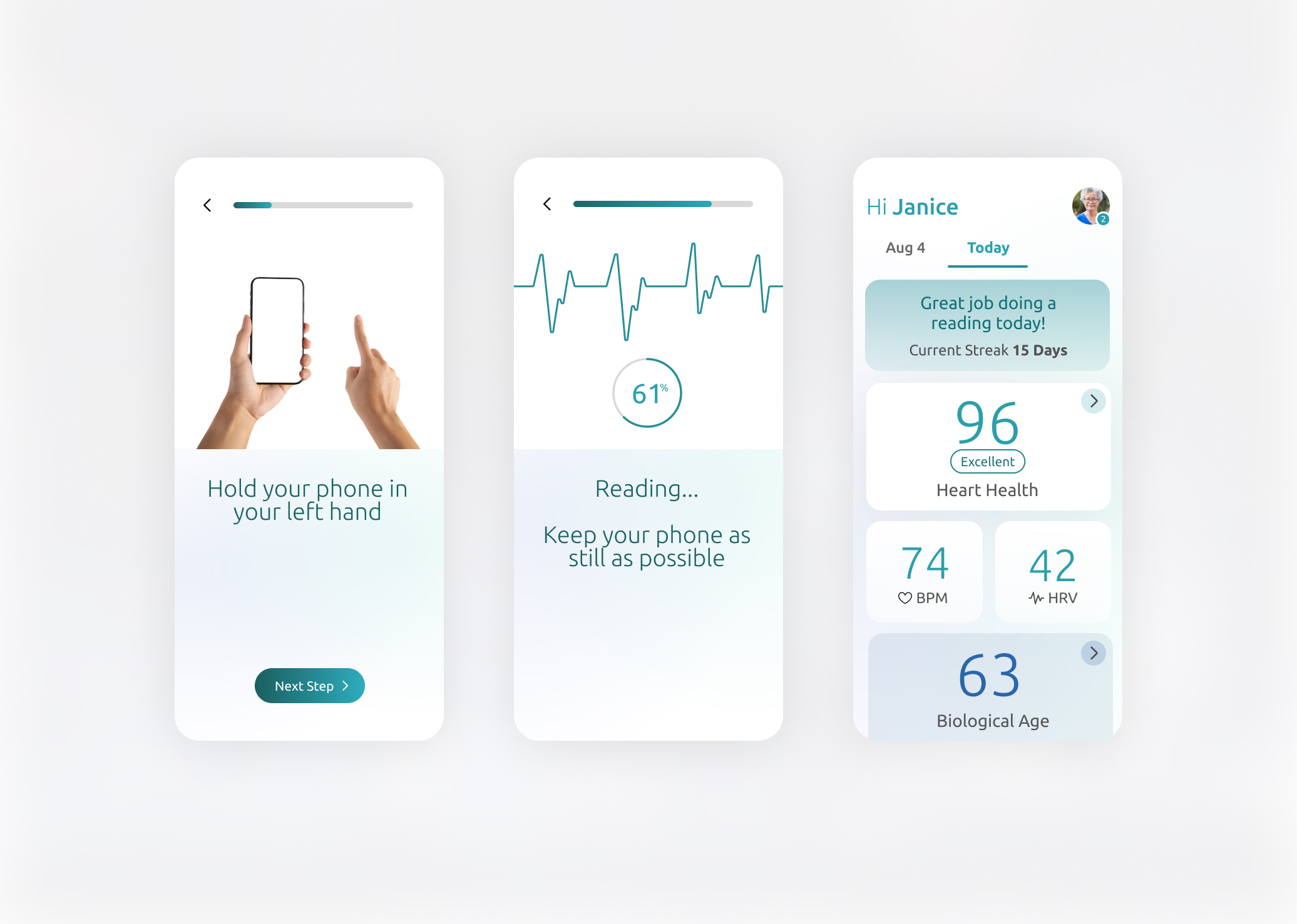
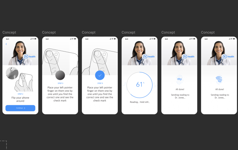
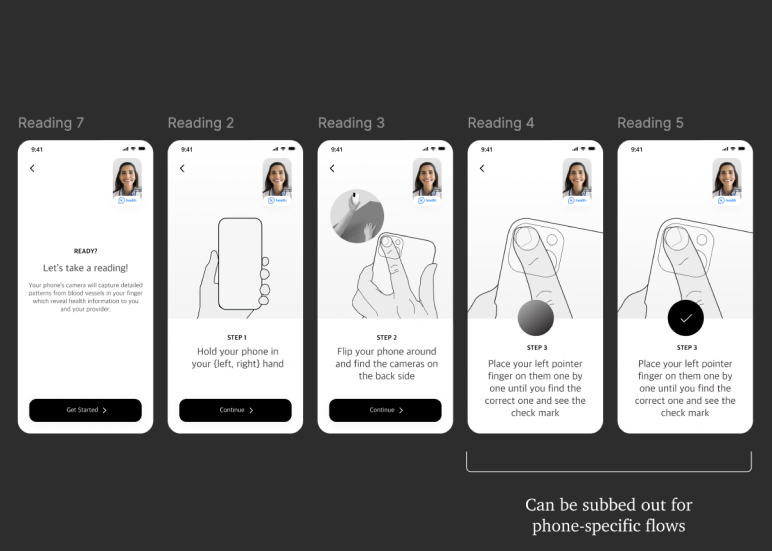
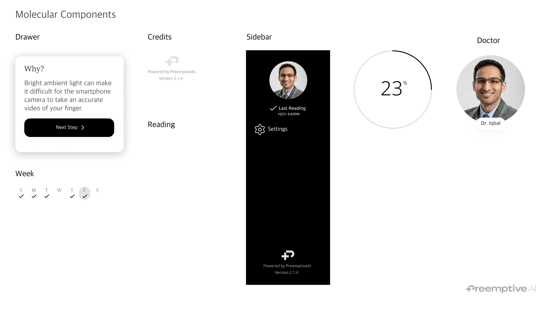
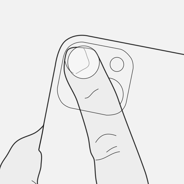
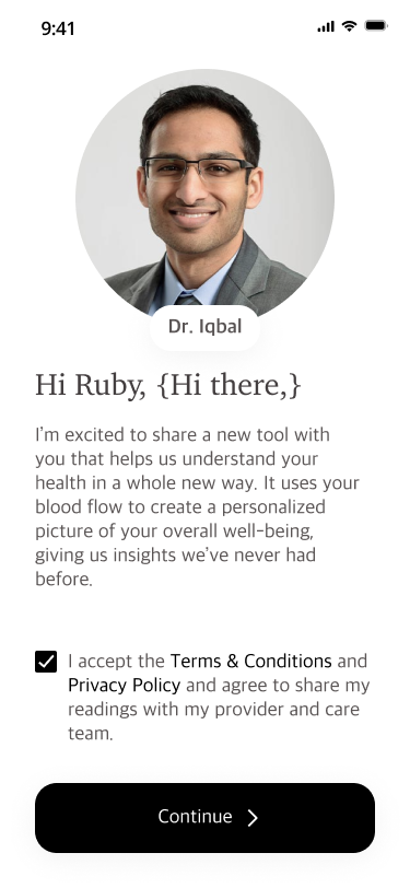
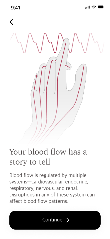
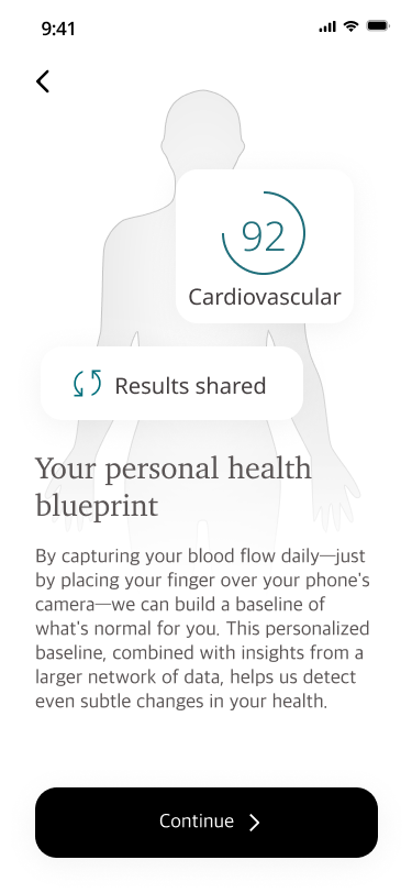
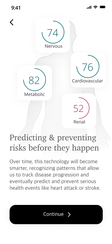
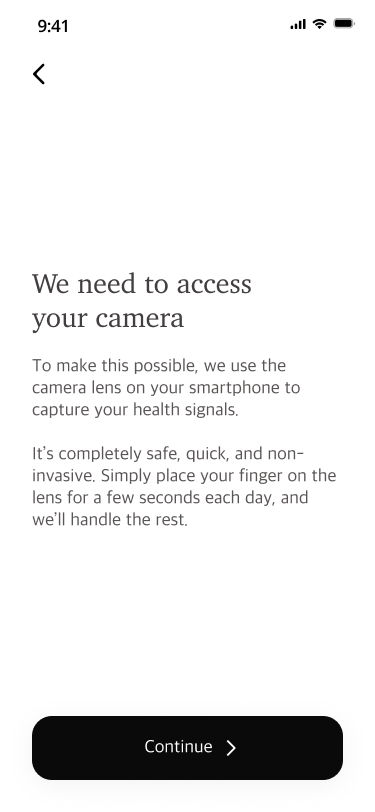
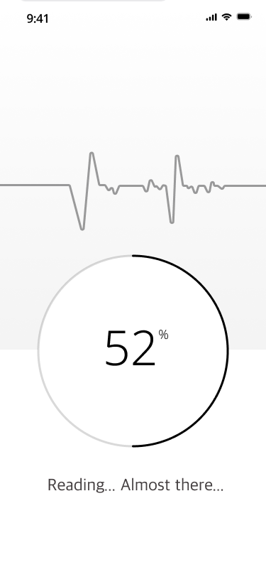
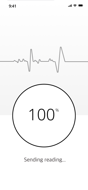
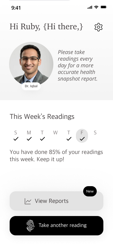
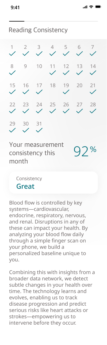
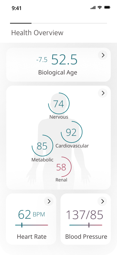
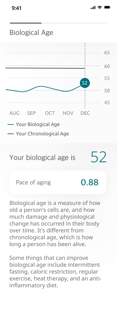
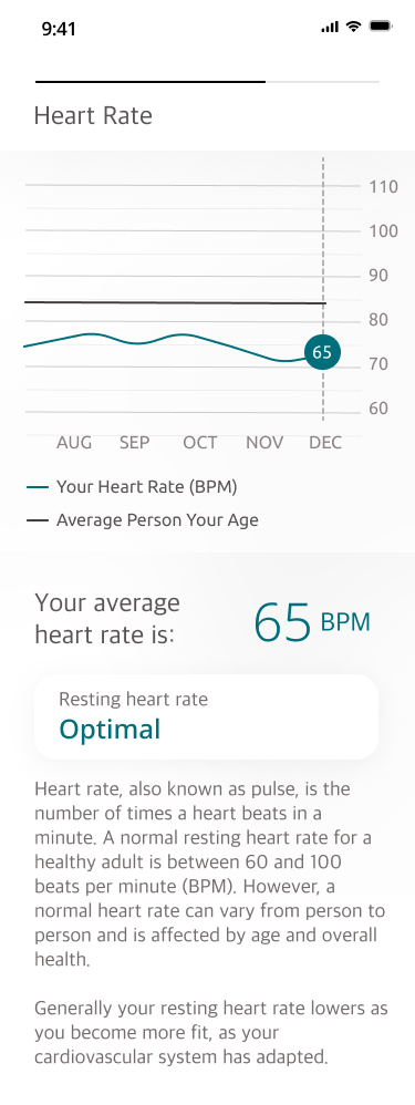
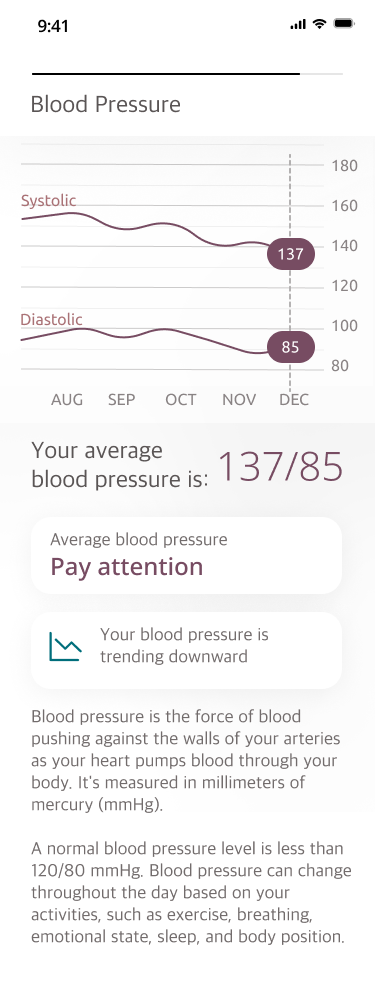
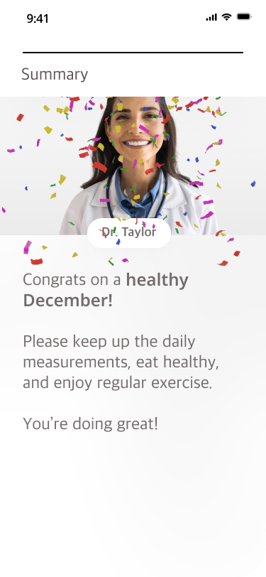
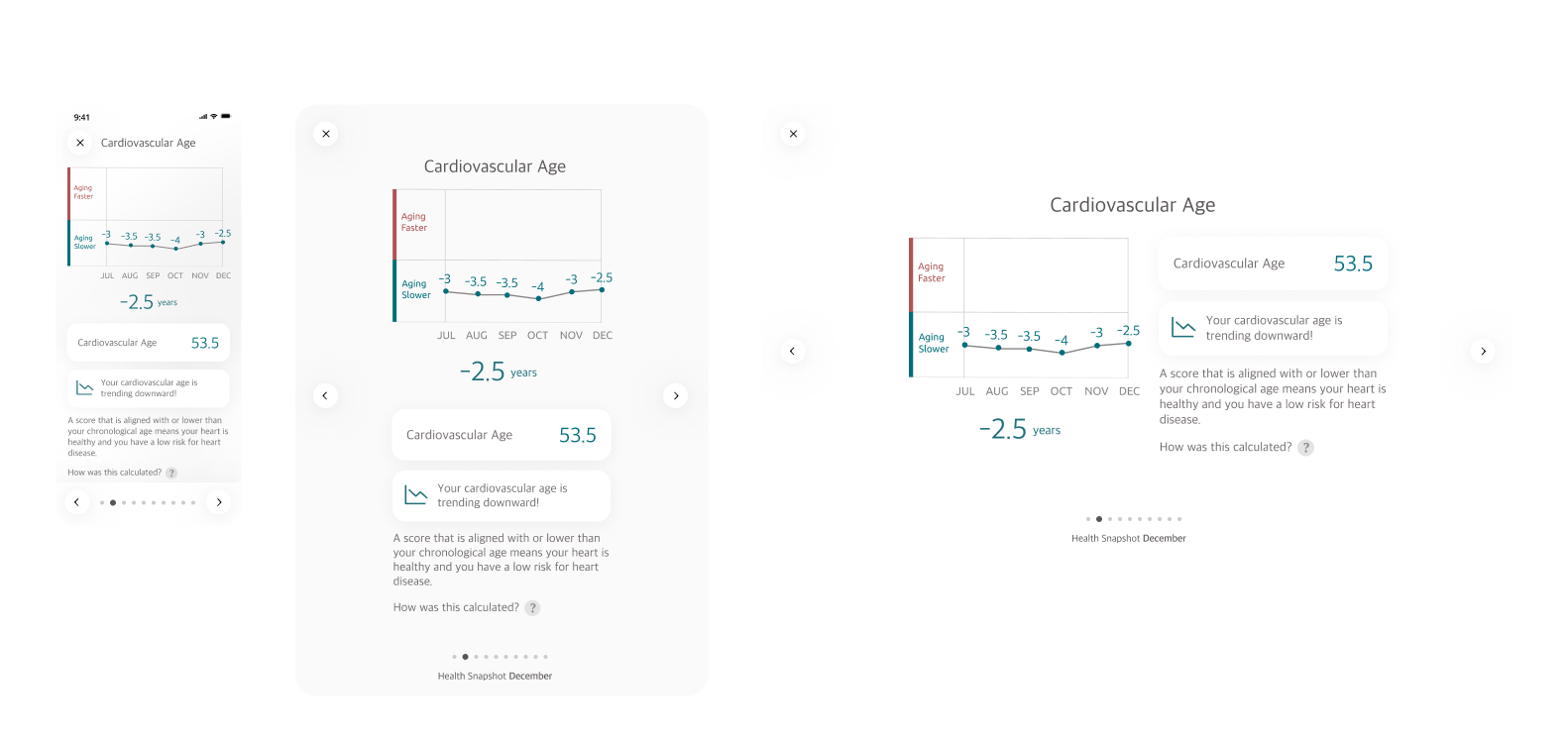
PreemptiveAI is a Seattle-based health tech startup focused on the growing RPM (Remote Patient Monitoring) market. With a simple daily blood pulse check up on your smartphone, PreemptiveAI is able to assess overall health, biological age, and health risks, and can communicate that risk to both the patient and their provider. In this way they are carving out a more proactive (preemptive!) approach to healthcare.

MY ROLE
  • UX Design
  • UI Design
  • Product Design
  • Prototyping (Figma + HTML/CSS/JS)
  • Illustration
ACCOMPLISHMENTS
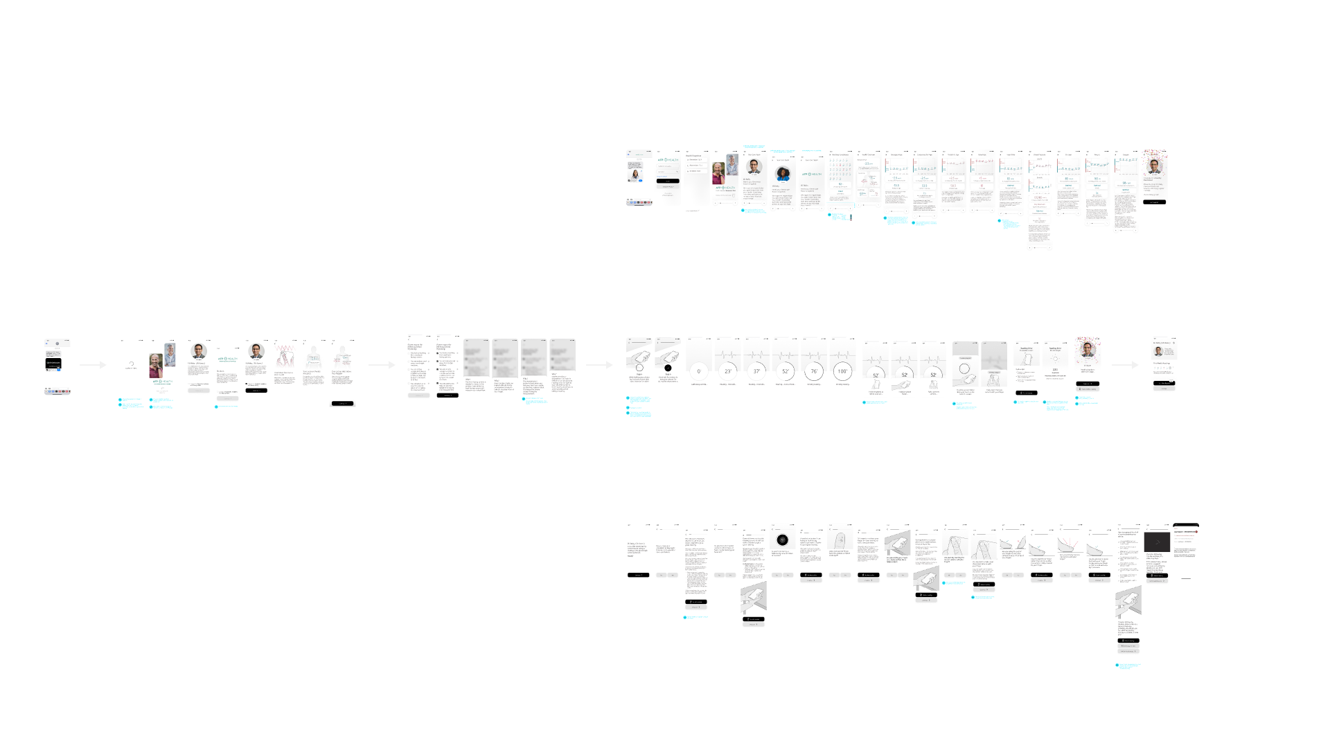
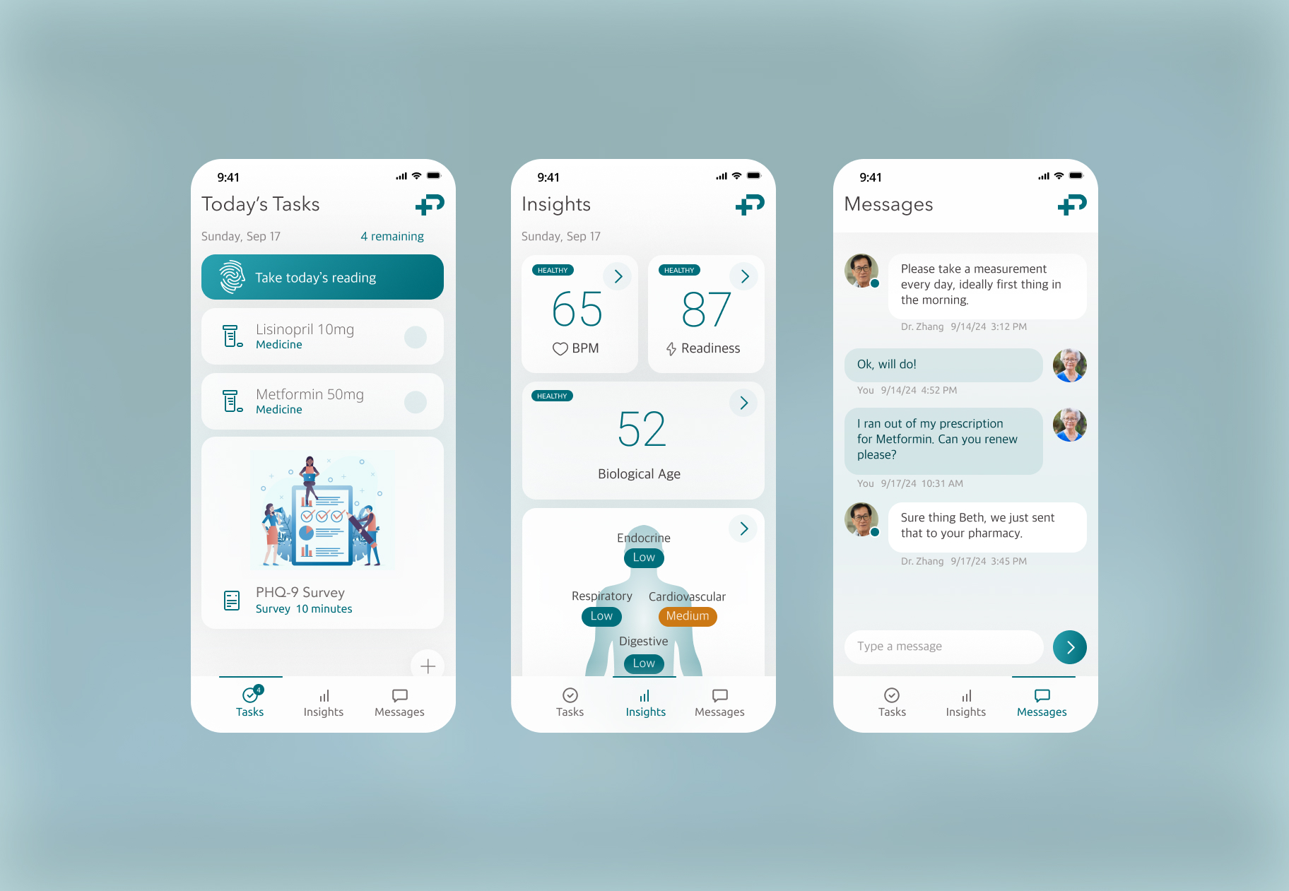
  • Led UX / UI design for a revamp of native app.
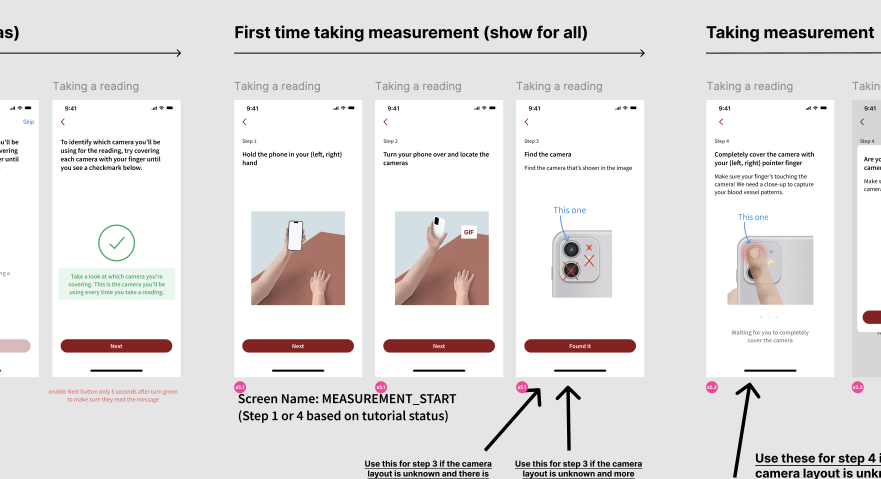
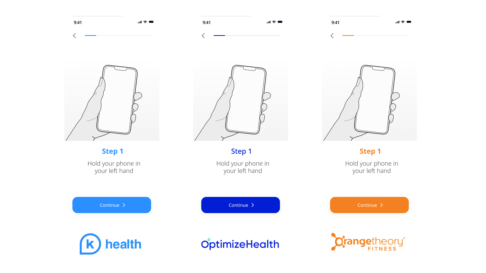
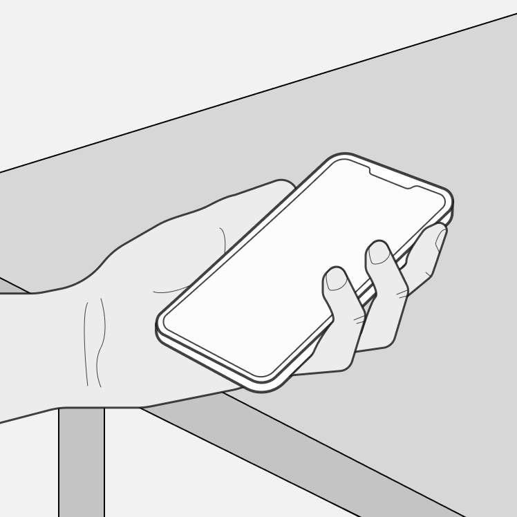
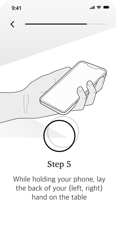
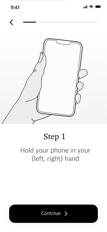
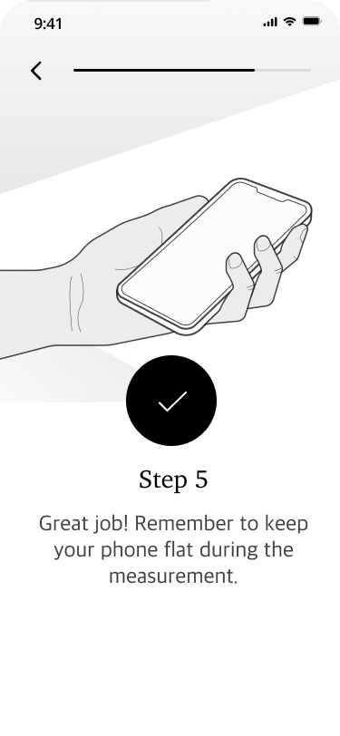
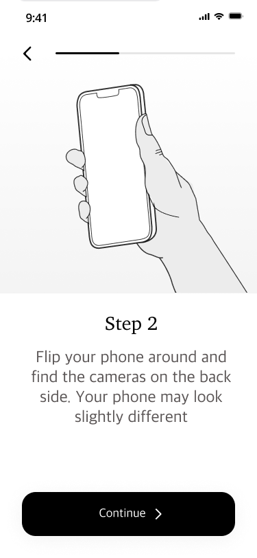
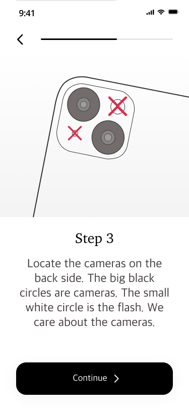
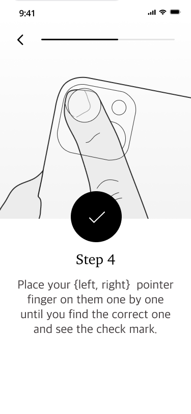
  • Custom vector illustrations and animations to make a highly simple and intuitive UX
  • Design work has helped company find 2 new partners (Optimize health and Evidation).
  • Significantly increased adoption and retention in the app.

PROBLEM

How can we deliver a trustworthy, simple, and intuitive user experience for daily measurements that motivates seniors to take readings everyday?

OLD DESIGN

The initial design from the CTO was largely a proof-of-concept that got the functionality there. It was also used to gain more insights into how to make the measuring experience as intuitive as possible.

Insights

From informal usability testing with many participants and discussion with internal stakeholders, the following insights were already clear prior to me joining the project:

Onboarding needs to be more informative and educational

End users need to understand the value the app provides and why it's important to take readings everyday.

Reading experience needs to be more intuitive and robust

We need to use higher quality illustrations and animations to help convey how to properly take readings in the app.

It also needs to be more robust and provide more feedback to the user.

Patients need to view their health insights

To help motivate daily readings, patients need to periodically view their health insights and trends.

EXPLORING NEW VISUAL DESIGN DIRECTIONS

Initially I wanted to explore visual design directions that more warm and inviting. Rounded corners and muted colors communicate calmness and trust.

BRAND AND DESIGN SYSTEM

We decided to keep the brand as neutral as possible to allow for easy integration with many different partners and to keep the brand professional and polished.

ILLUSTRATION AND ANIMATION

I created a series of illustrations and animations to help convey how to properly take readings in the app. The audience being mostly seniors, I wanted to make the process as simple and intuitive as possible.

ONBOARDING

READING

INTERACTIVE PROTOTYPE

MONTHLY REPORT (MOBILE)

MONTHLY REPORT (RESPONSIVE CONSIDERATIONS)

MONTHLY REPORT (INTERACTIVE PROTOTYPE)